Tone and Color
The psychology behind colors in film
A well-designed movie color palette evokes mood and sets the tone for the film. When choosing a particular color, remember that there are three main components — hue, saturation, and brightness.
-
Hue – the color itself
-
Saturation – intensity of the color
-
Brightness – The darkness or lightness of a color
As Bond mentions in his film color theory video, many viewers will have predictably similar reactions to certain colors. A strong red color has been shown to raise blood pressure, while a blue color elicits a calming effect (more on this when we discuss lightsabers later).
Stanley Kubrick's directing style relies heavily on color to create highly impressionable images and scenes. With color in mise en scene, Kubrick is a filmmaker that understand that color has a direct and powerful impact on the viewer. Here's a breakdown of the color palette across all of Kubrick's best films.

types of color schemes

MONOCHROMATIC COLOR SCHEMES

Monochromatic color schemes come in shades of a single color such as red, dark red, and pink. They create a deeply harmonious feeling that is soft, lulling and soothing.
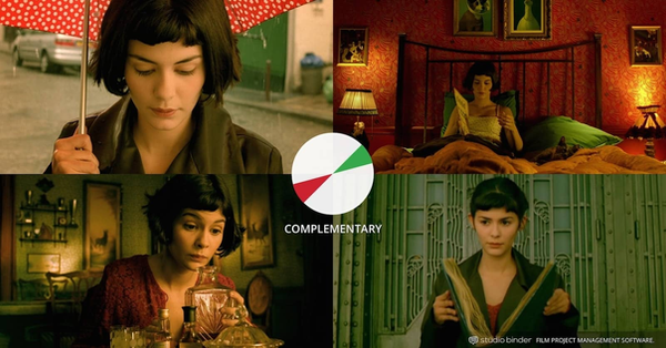
COMPLEMENTARY COLOR SCHEMES

Contrasting drama (i.e. warm vs. cool), complementary colors live opposite each other on the color wheel. For example, orange and blue are complementary colors commonly used in the color palettes of many blockbuster films.
Dueling colors are often associated with internal or external conflict. No matter the color selection, complementary colors combine warm and cool colors to produce a high-contrast, vibrant tension in the film.
ANALOGOUS COLOR SCHEMES

Analogous color schemes utilize colors that are next to one another on the complementary color wheel. They tend to occur in nature and create a harmonious feeling that is pleasing to the eye.
Good examples of neighboring colors that can create analogous color schemes are red & violet, or yellow & lime green. Since the colors lack the contrast and tension of the complementary colors, they instead create a kind of visual unity.
In general when creating an analogous color scheme, one color is chosen to dominate, a second to support, and a third (along with blacks, whites and grey tones) to accent.
TRIADIC COLOR SCHEMES

A triadic color scheme is when three colors that are evenly spaced around the complementary color wheel are used in conjunction.
One color in the triadic colors scheme is chosen to be the dominant one with other two used in complementary fashion. Triadic color schemes are somewhat less common because they can look a bit cartoonish, especially when the HSB are all elevated, like in Superman.
But does that mean that a triadic color scheme can only be used in movies like Superman? No, of course not, and the way around this is to keep avoid HSB lower: less bright and less saturated.
How to use color in film symbolically
DISCORDANT COLOR
Discordant use of color in movies can help a character, detail, or moment truly stand out from the rest of the film. For example, the color blue in Amelie, or the color red in The Sixth Sense.


Discordance is a deliberate choice by the director to deviate from the balanced types of color schemes and color palettes we’ve mentioned to refocus attention.
ASSOCIATIVE COLOR SCHEMES

Associate colors in film refers to when a recurring color or scheme represents a theme or character in a film, thereby connecting visual spectacle with emotional storytelling.
In one of the top Christopher Nolan movies, The Dark Knight, both key characters in the drama have their own associative colors palettes.
TRANSITIONAL COLOR SCHEMES
In the case of Up, following the Pixar storytelling formula, the shift in color palette represents a change in story tone. A happy gleeful time has given way to a dark depressing reality. The darker reality is shown in shadow, with a bleak drab color palette.

The Up movie color palette shift isn't necessary — we can see for ourselves what has happened to Carl and his wife. But the color shift amplifies the emotions on screen. It brings that intangible element to visual storytelling that we feel more than we see.